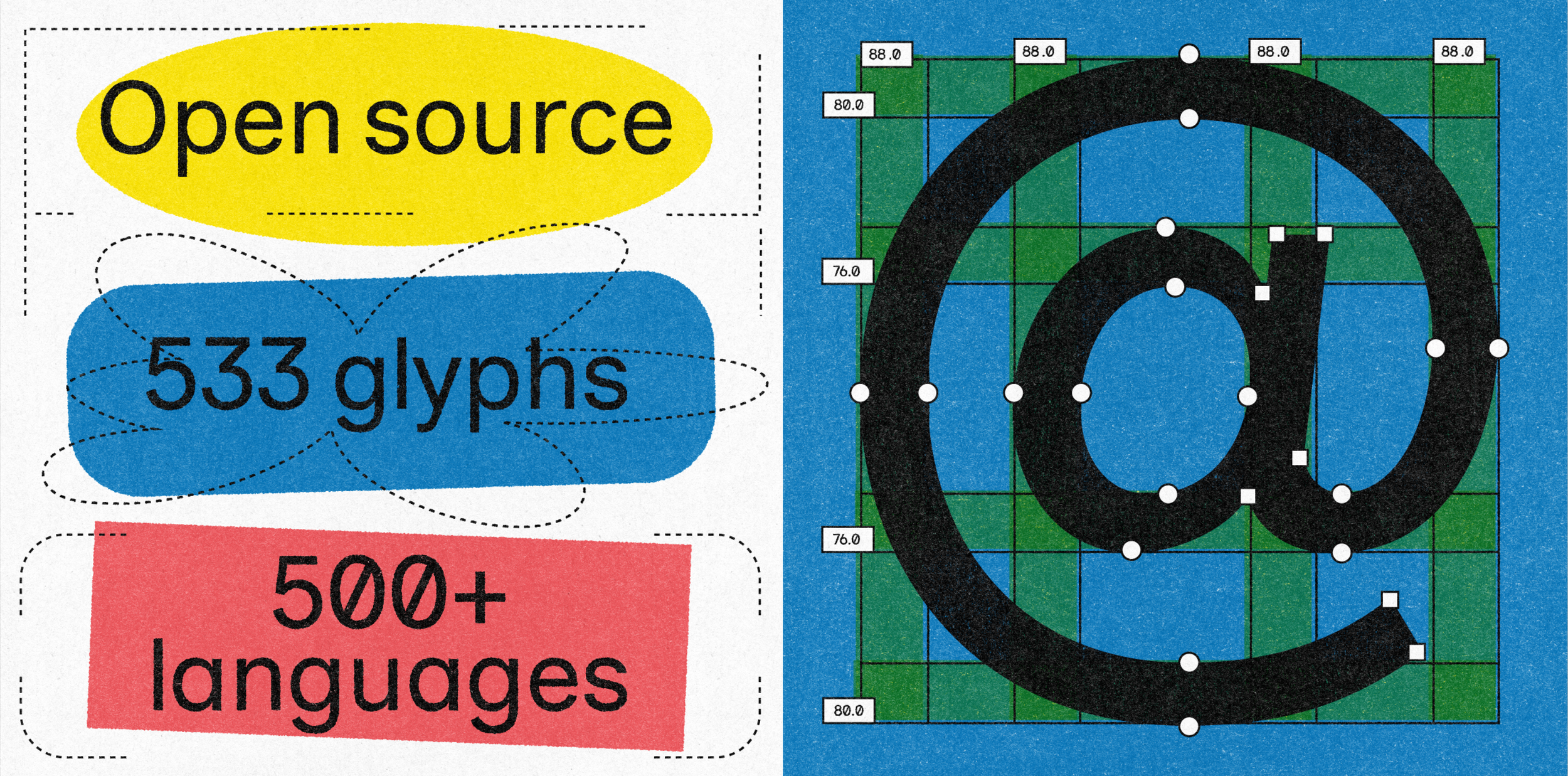
Inclusive Sans

Inclusive Sans is a text font designed for accessibility and readability. It is inspired by the friendly personality of contemporary neo-grotesques while incorporating key features to make it highly legible in all uses.
Over the last few years, the conversation and guidelines around accessibility in typography has largely centred on type sizes and colour contrasts. However research highlights that details like letter differentiation and spacing are critical for those who are visually impaired or neurodiverse.
Extensive academic research and particularly Sophie Beier's book Reading Letters: Designing for Legibility, Microsoft’s research with their typeface Sitka, as well as Gareth Ford William's Guide, outlines key criteria for an accessible typeface:
Non-mirroring of letters (e.g. d, b, q and p)
Distinction between similar forms (e.g. O and o)
Wider, more open counter forms (e.g. c, o, a and e)
A higher x-height for easier readability at small sizes
Wider default letter-spacing
Clear difference between capital height and ascender height
Inclusive Sans follows this criteria and aims to retain a contemporary feel that makes it versatile for a variety of applications.
The typeface also supports over 500 languages across the world. Living and working on Gadigal Country (Sydney, Australia) I also felt it was important to include support for Aboriginal and Torres Strait Islander languages. There are an additional 48 glyphs incorporated with the help of Vincent Chan (in consultation with Sasha Wilmouth from the University of Melbourne).
Making Inclusive Sans has been a labour of love for over 3 years, and continues to be an ongoing project with accessibility user testing. The goal is simple: to make accessibility the default rather than the exception, creating a typeface that not only meets rigorous legibility standards but feels contemporary, welcoming, and truly inclusive for everyone who reads it.
Special thanks to Troy Leinster for his coaching through Typemasters.
Go Fund Me Sponsors
Inclusive Sans has always been a labour of love, and to support its continued development a Go Fund Me has been set up. A huge thank you to those who’ve supported so far:
Mable
Canva
Mat Groom
Tim Cruickshank
Brendan King
Patrick Carrol
Melanie Schonfeld
Belinda Craigie
Pete Conforto
Lucy Irwin
Stacey Saunders
Ashlea Smith